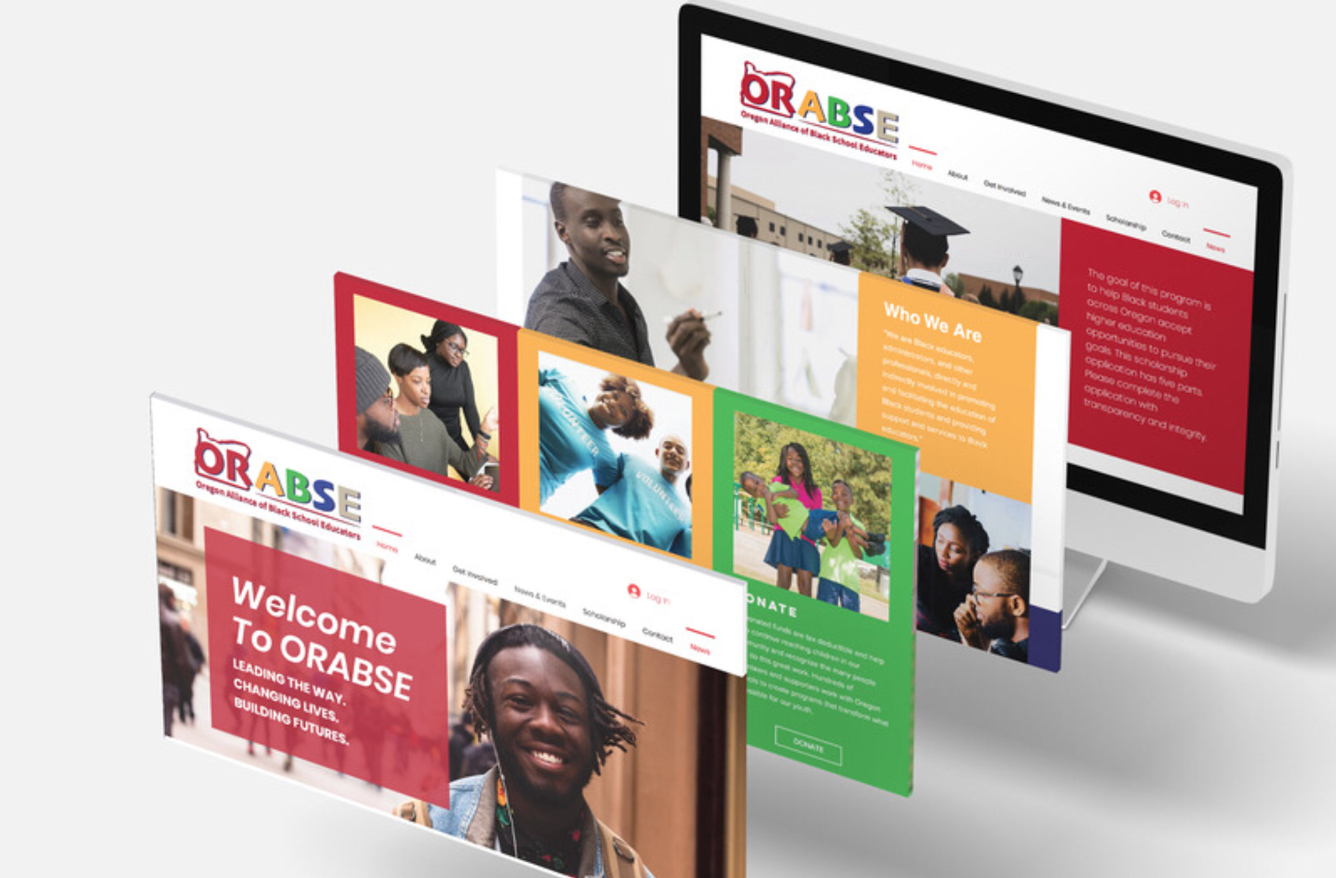
After working with the OABSE team for years on different projects, I was honored to be asked to head the redesign and rebranding project. Together with the new president and executive team, ORABSE was created.
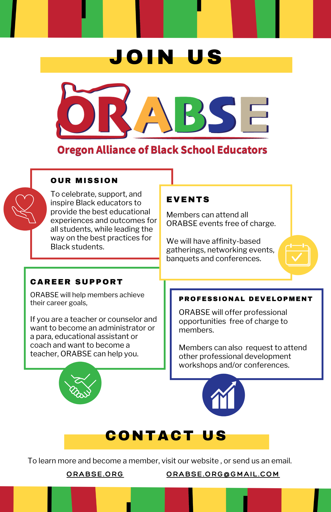
With the history and older designs of the logo in mind, I went with a more bold and fun font with updated, brighter colors, as ORABSE's mission was to open up their membership to be state wide instead of just Portland based, meaning they needed a more open and welcoming brand. The website was also redesigned with the same brighter and clearer concept, able to display more information to be a greater resource for new members.
Website: https://www.orabse.org/